


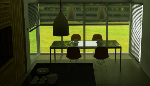
There are examples of my 3d, interior visualizations. Scene modeled/ textured in Rhino 3d and Cinema 4d . I also have used some of my product design in this scene.
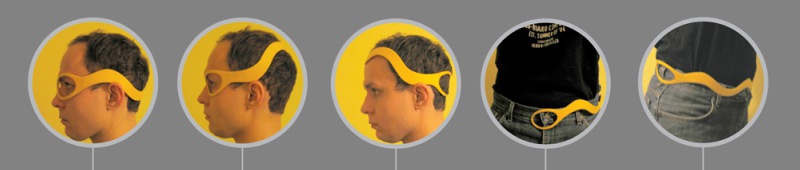
Hello there, Here is my concept of multifunctional eyewear. The main idea was to create glasses which will be easy to manufacture, multifunctional and modern. The whole frame in my prototype was made with one piece of plastic then shaped in high temperature. My eyewear can be worn on many[…]


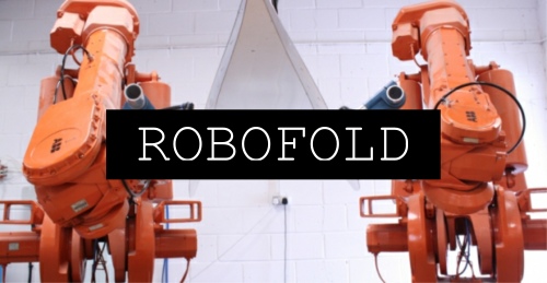
Last week I have attended another Makers Guild meetup. There were two guests. Jamie Elliot of JAILmake and Gregory Epps of Robofold. Below you can watch a video recorded during that event.
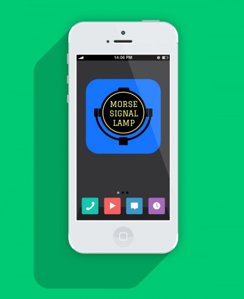
This is a sneak-peak of my app for Iphone and Android OS, currently in development stage. Below I present a short overview what this app does: -converts written text to Morse code and viceversa. -has ability to send a Morse code message continuously(SOS) -converts light signals to Morse code and[…]
Hello there! Check out my new poster design. Don’t forget like my stuff on Facebook and share my creative stuff via Twitter– Thanks! If you want me to design a poster, leaflet,flyer or logo please don’t hesitate to contact me.
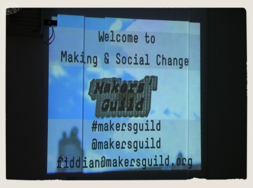
About week ago I have attended in very interesting event organized by: Fiddian and Kirsten from Makers Guild . It was the first event where invited speakers talk about their projects and share own experience. You can watch here a lecture I have recorded during this meetup. The video is split[…]
Currently I’m in the process of uploading my new design stuff on the website. Here is one of my posters designs ‘The Asylum’ and few of the logos I have made. If you like my designs please follow me on Facebook and Twitter. If you want similar logo or poster for[…]


